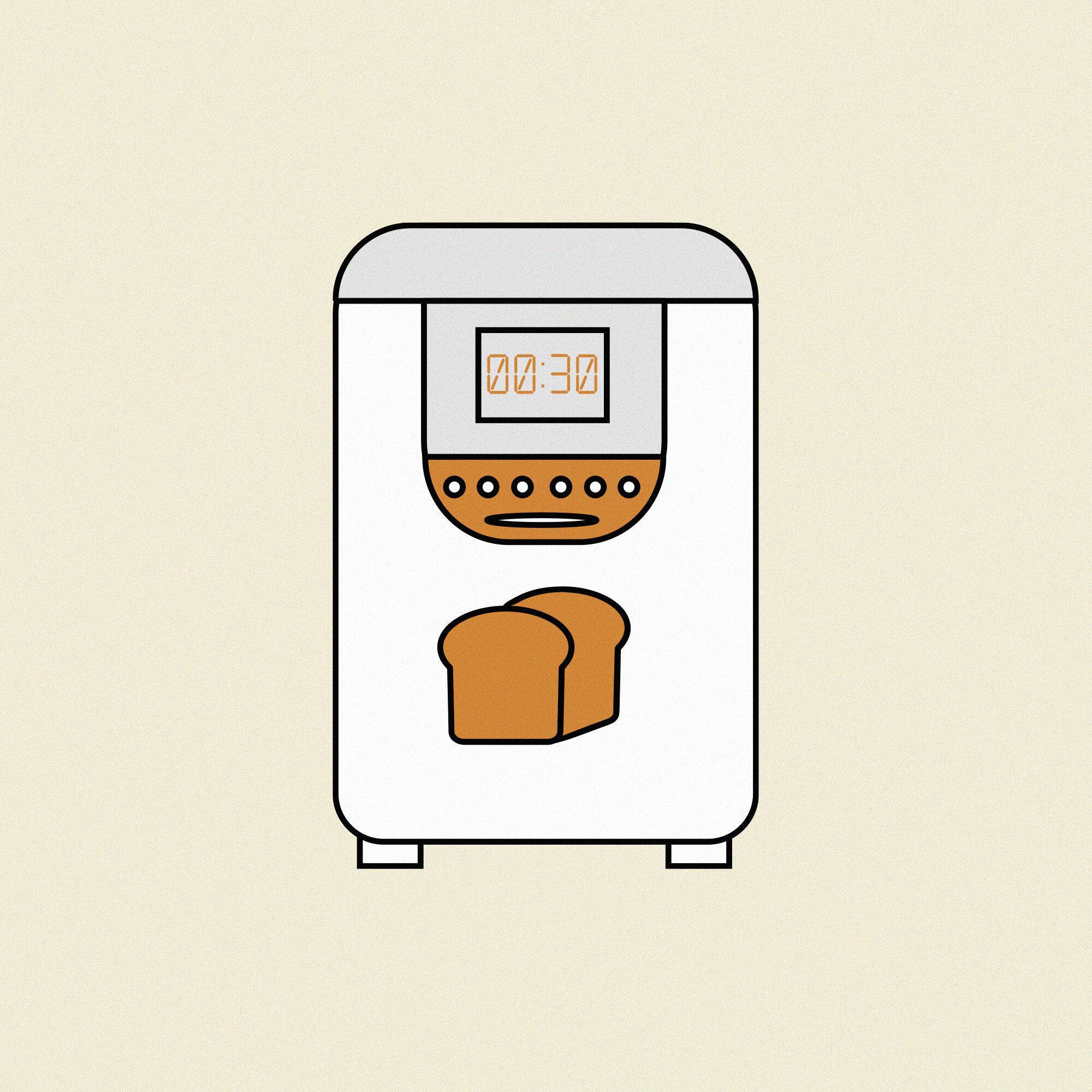
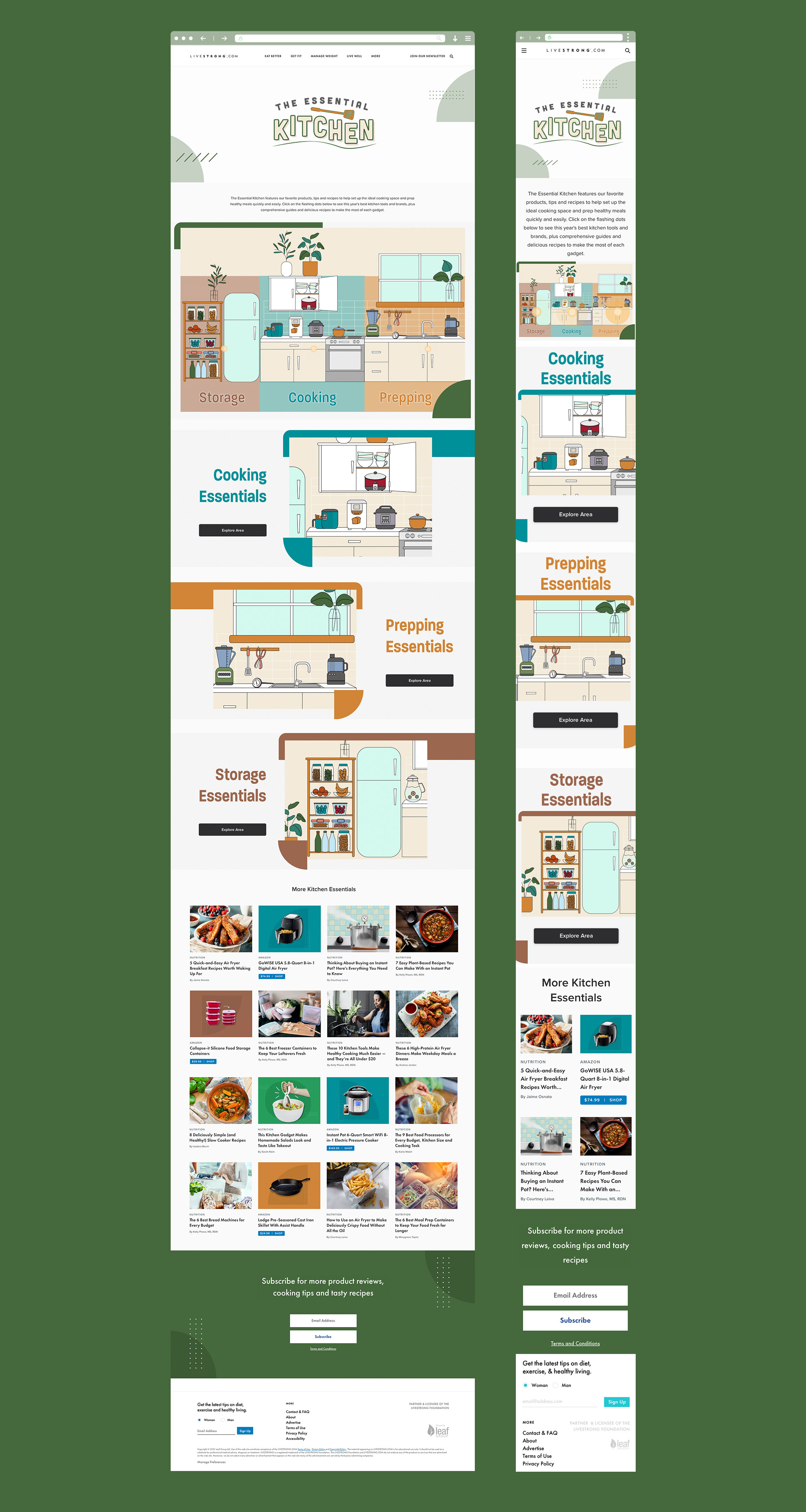
My task for this project was to brand Livestrong.com’s franchise “The Essential Kitchen” hub. This hub is dedicated to a series of articles that recommend the best brands of appliances to make healthy food. The main tool of the hub is using the kitchen illustration as an interactive map for users with designated hotspots for each kitchen section. You can view the live hub here. I made it an objective for myself to make these illustrations as simple as I could but with enough detail to tell them apart. All colors were pulled from Livestrong’s nutrition and live well style guide vertical colors.

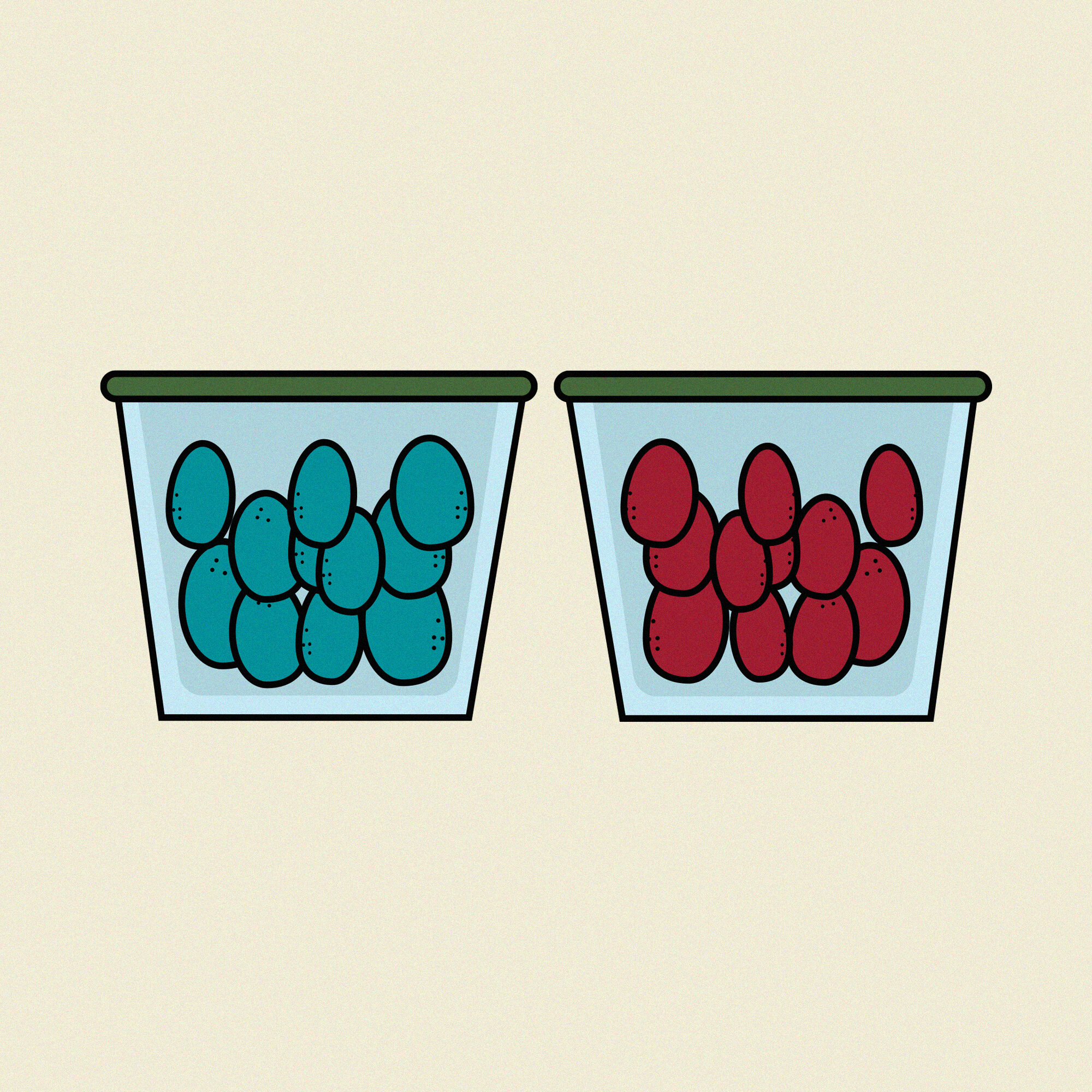
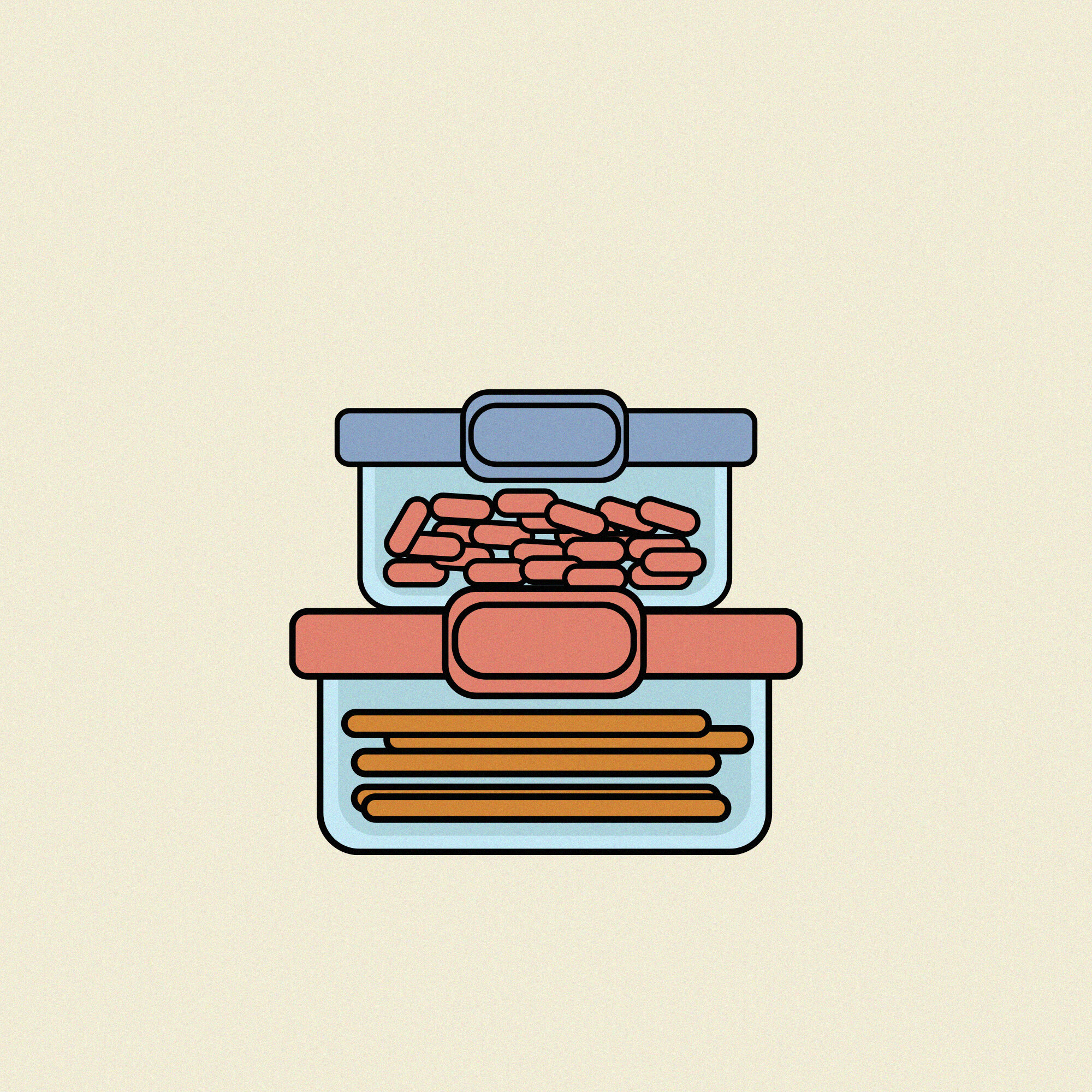
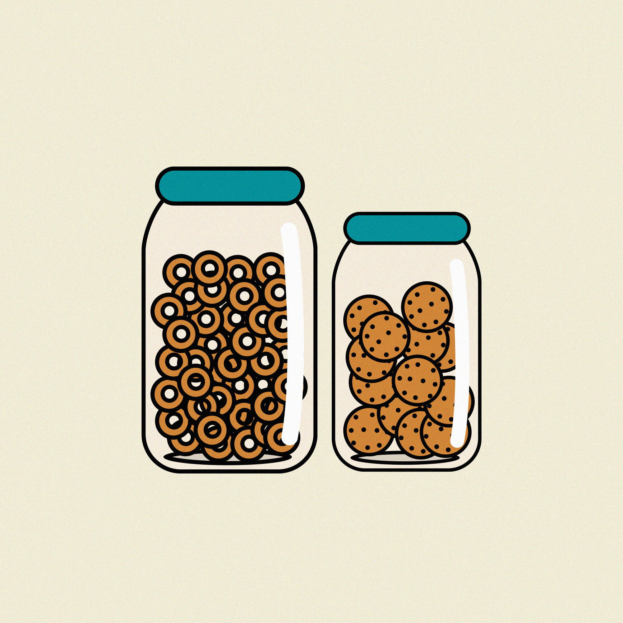
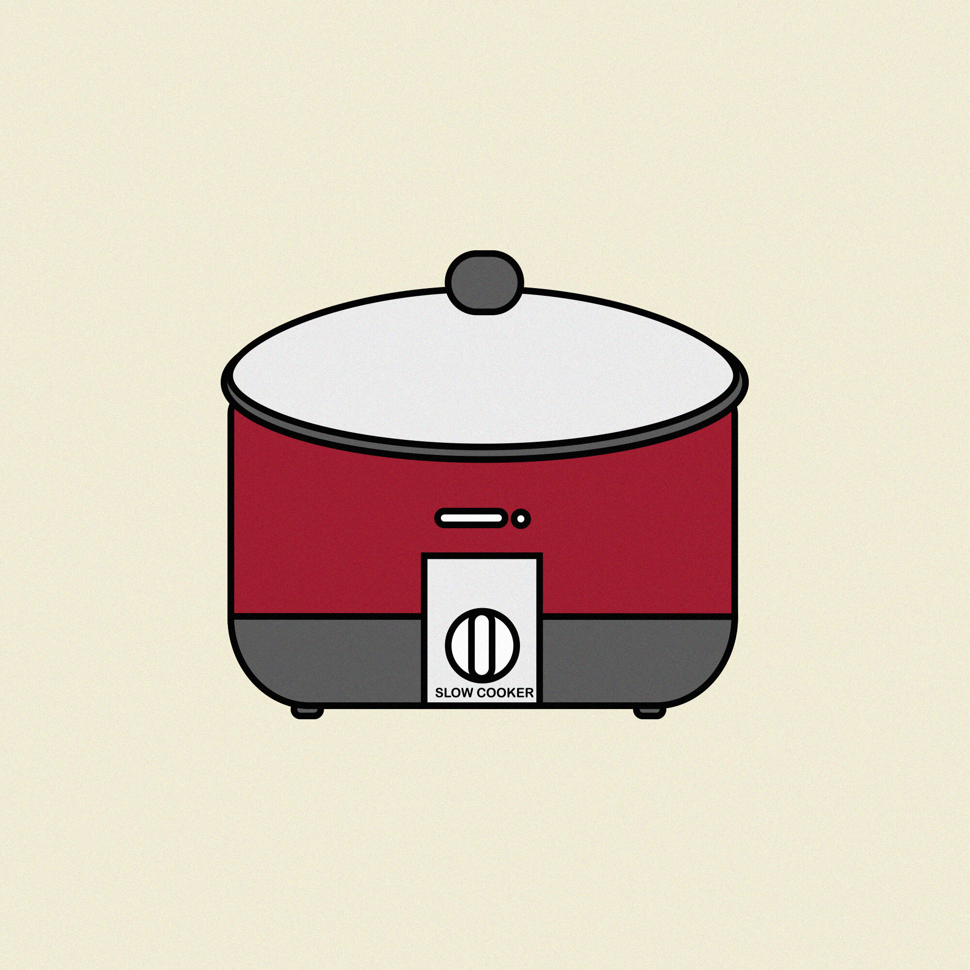
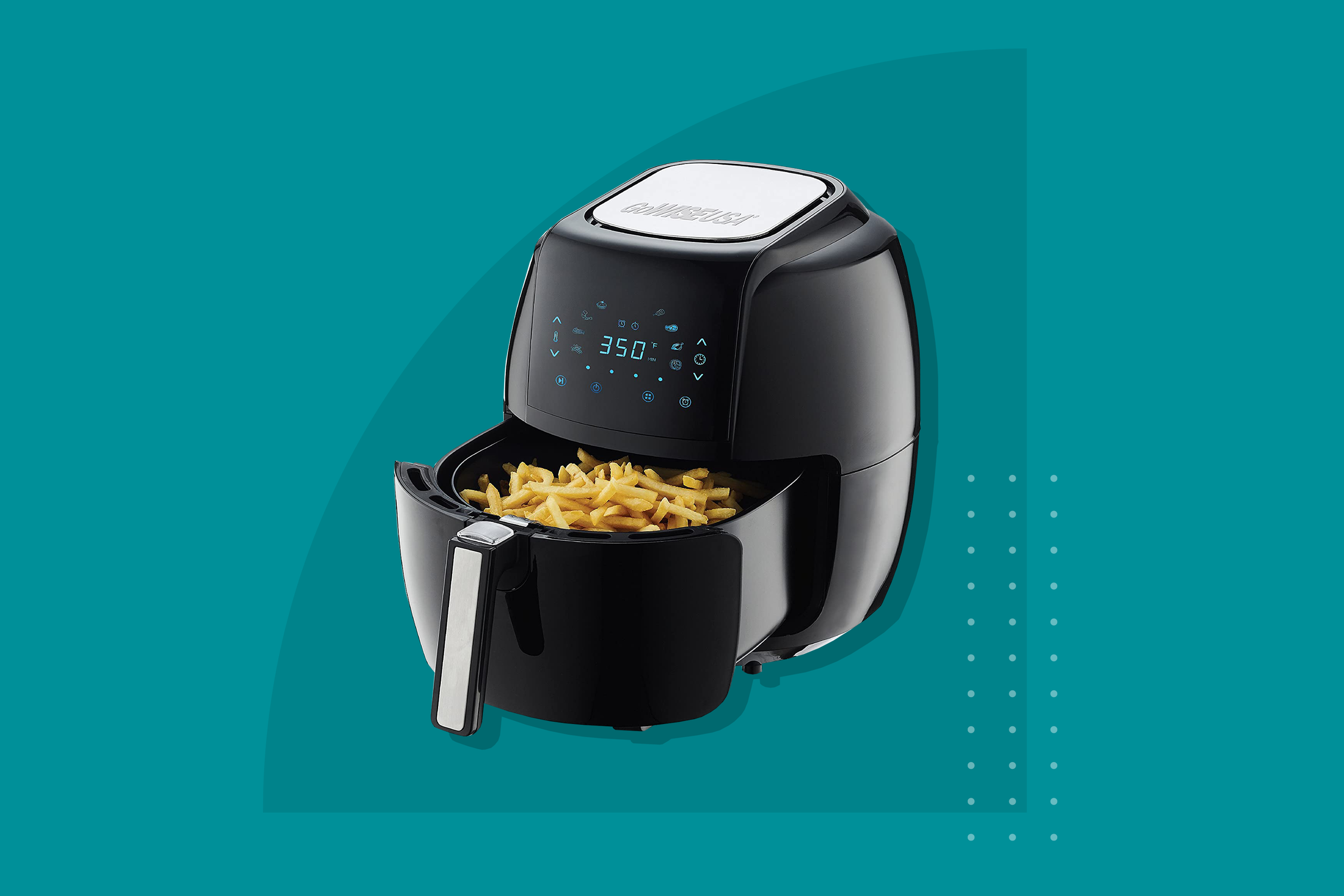
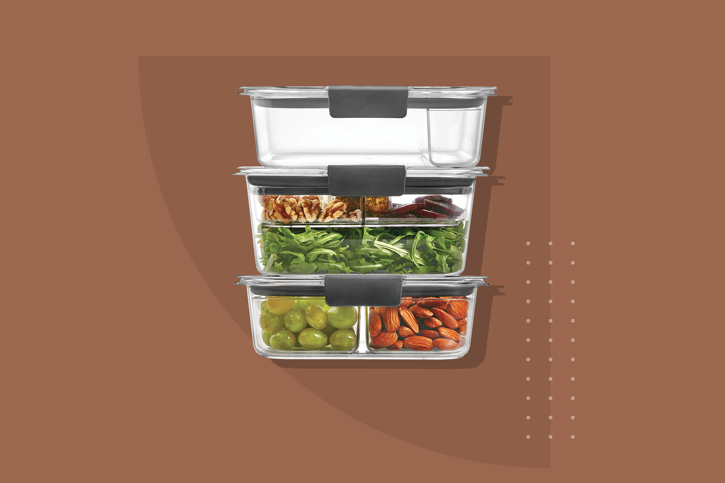
Each product listing page has styled images with colors and elements tying back to the Essential Kitchen hub.

The kitchen was highlighted with 3 different sections.
Storage, cooking and prepping– and for each the illustration was cropped to only show that section and its appliances. The containers for each stack on mobile with the name of each section on top, to reach the user first. The whole kitchen and it’s appliances were hand illustrated in illustrator using only Livestrong’s eat better vertical colors to keep it all cohesive and within brand.